I was surprised I couldn't find a graph like this already on the forum, so I made one and thought I would share it:
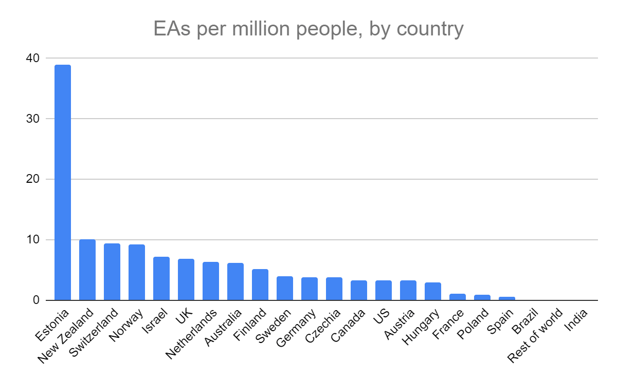
The data is from the 2022 EA survey,[1] and here is my sheet.
The main surprising thing to me is that English-speaking countries are less dominant than I expected, in this per capita framing. My vague sense was that the EA community was notably more popular in the Anglosphere than even in other rich countries, but eyeballing this data makes me think I was wrong: Northern/Western Europe seems to have quite comparable rates of EAs.
And what on earth is happening in Estonia? Perhaps some Estonian EAs can tell us all what you are doing that works so well!
- ^
Maybe there are quite different response rates by country, and this could explain some of the variance but I assume there isn't a large or systematic effect here.
My impression is that Jaan Tallinn's interest in rationalit- and EA-related projects, going back a long time, was one factor in Estonia.
Yeah, given the GDP-per-capita graph shared by William the Kiwi, and Estonia being the home of one of EA's most generous donors, I suspect that availability of philanthropic funds may be the bottleneck for local EA growth.
It wouldn't surprise me if low-GDP countries have many stories like this one or this one, of motivated people struggling to obtain funding due to lack of connections with philanthropists. If true, that would be an unfortunate situation -- lower GDP per capita often goes with a lower cost of living, meaning you get more bang for your philanthropic buck, all else equal.
Maybe we need a new sort of "digital nomad EtG/grantmaker EA" who travels around, networking with EAs in the developing world to identify great giving opportunities. This could go well with a cause area like AI alignment which can be done anywhere and could benefit from fresh thinking:
https://forum.effectivealtruism.org/posts/eToqPAyB4GxDBrrrf/key-takeaways-from-our-ea-and-alignment-research-surveys
As far as I know, Jaan Tallinn has not contributed significant amounts of money towards EA community building in Estonia directly.
Thanks for the post! We have quite a bit more data and analyses we can make available on this. It will just take a little while to put together in a publishable form.
Nice! Seems like from the interest generated on this post there is a fair bit of appetite for this.
This is great! I think the survey team didn't do a per capita visualisation because response rates will probably vary a lot between countries for reasons other than the number of EAs per capita.
To provide another data point, @Alix Pham from EA Switzerland put together a sheet with attendees per capita for EAG London this year and just now I made a quick chart.
Obviously, due to the location of the event, some countries will be over-represented and others under-represented, but I think it might be a more accurate representation of per capita rates in Europe (with the exception of the UK).
NB some of these countries have a very low number of attendees, e.g. Iceland only had one attendee. I made the below to visualise this.
Wait up, the USA didn't even make the list...?!
Surprising, although I guess this is just because there are plenty of EAGs in the US already.
They were second largest in absolute terms, 214 attendees. But that means only 0.6 per million, putting them in 24th place in the per capita ranking.
In absolute terms, the top 4 ranking was: UK (675), US (214), DE (95), NL (61). Why am I giving a top 4 ranking instead of a top 3 ranking? No reason...
Yeh, as we note here:
The last time we reported this was 2020, with the caveat that "Iceland, Luxembourg and Cyprus, nevertheless have very low numbers of EA (<5) respondents. This graph doesn't leave out any countries with particularly high numbers of EAs, in absolute terms, though Poland and China are missing despite having >10."
We'll discuss the details more in the post we are putting together on this (hoping to release this month), but there is indeed quite a lot of noise when you look at EAs per capita, and in particular the highest EAs per capita countries, due to small populations and small numbers of respondents, often close to zero (e.g. small countries can jump in and out of the top rankings based on having 5 or 0 respondents in a year). In the full post we'll additionally examine results for composites of years (e.g. 2020-2022), and which countries outperform what a model would predict (though that will be heavily caveated).
Nice! Yes good idea to use EAG data - I wonder if it would interact with which countries have an EAGx of their own, e.g. are some people in Germany or Netherlands or wherever else less likely to come to EAG when they know they can go to a conference domestically later in the year? Perhaps it would only be a small effect.
I think this method of presenting the data makes the countries not present much less salient (e.g. Portugal, Denmark, Ireland) so there mere fact that there are a lot of countries in Europe means they will tend to fill up the chart. To test this hypothesis I think you'd want to compute a single % for continental europe to compare to a single Anglo number.
Estonia clearly a massive standout though!
I agree with that.
Also, notice that the top countries are pretty small. That may be because random factors/shocks may be more likely to push the average up or down for small countries. Cf:
The classic fact about variance in small populations, from the start of "thinking fast and slow". Love it!
True!
Of course if we had all the data we could run a fancier statistical test. I suppose my observation is limited to the fact that the English-speaking vs European ranges seem similar rather than e.g. all the Anglosphere countries being distinctly higher than all the European countries.
You could do a funnel type plot where your y-axis is EAs/capita and your x-axis is 1/sqrt(population), which is sort of what you'd expect the standard deviation to look like.
OK this is what we get, using the 25 EAs cutoff for the red line.
Hmm.... That cutoff is really making it hard to assess what's going on here IMO. Everything is kinda clustered close to the line making me suspect the selection effect is important.
Yeah, I made a quick chart comparing anglosphere vs non-anglosphere
Nice, yes very different in this framing! Possibly the more interesting comparison to me would be not Anglosphere vs rest-of-world but rather Anglosphere vs Western Europe, or OECD countries or something. Also depending on how we compute the averages (country-scaled or population-weighted) results could be quite different.
I had the same thought! If I haven't messed something up:
Matches my impression, thanks for making the chart!
True, I don't have access to the raw data sadly, only to the data from the EA Survey forum post which has a minimum number of EAs cutoff.
You could produce conservative and aggressive versions by assuming either =0 or =(cutoff-1) for the missing values and then plot the range, maybe it will be tight.
sure, for e.g. China or any large-ish country this works, but as soon as population <1 million or so the range would be very wide - e.g. Iceland presumably has some EA presence but it would be strange to put it at the top without knowing the actual data. If I wanted to spend more time on this I think just asking for the raw data would be best (I am unsure if they would give it to me, and I haven't tried).
GDP per capita predicts most of the variance in EAs per million population. Estonia is a clear outlier, R^2 is higher with it excluded.
<Sarcasm>
New cause area: increase global GDP by multiple trillion to increase EA recruitment
</Sarcasm>
Here is the original chart adjusted for GDP/c. Estonia, New Zealand, Israel, and UK have more EAs than expected, the US has less. What might predict this difference?
How about the ratio of community age (or exp(community age)) to national population? See this comment
Instead of trying to identify a founding date for every country's EA community, maybe you could look at the year when it surpassed, say, 20 people in the survey. That data should be easier to find, and could also help address the issue of early false starts.
BTW I happened to see this comment which gives some interesting thoughts regarding why attrition in LMICs with small EA communities could be high. So my overall hypothesis at this point would be something like: the more EAs in your city, and the more EA funding that is available, the easier and more fun it gets to find out about EA and participate. If the circumstances are right, you can get exponential growth.
Thanks, good idea to make this graph, and indeed that is quite a high R^2! I wonder if a log-log version of this graph would be more informative, particularly for the y-axis?
Here is a log-log version, with trendline equations.
Link to doc https://docs.google.com/spreadsheets/d/1VETGm-EjAvQCsGToQCnYwqFzwVfU2TNEyjOtAriMbpc/edit?usp=sharing
Nice, yes quite a clear trend. Re David Moss's comment, it will be interesting to see what the fuller data shows, including countries with <25 EA survey respondents.
I was fairly heavily involved in community building in Estonia until 2022, we also don't know what we did right, sorry. @RichardAnnilo is the guy who's mainly responsible for this is, what do you have to say for yourself?
Difficult to say. I think it's just a lucky case of a small country that managed to get a few active organizers early on (and managed to get members fill out the survey 😁).
AFAIK, we haven't done anything significantly differently to other groups. It's been a fairly standard Intro Course, Career Course, Public Events, Core Volunteer Team setup.
Whether it's got something to do with the Estonian cultural landscape affecting people's readiness to join EA is hard to assess, as I have little experience recruiting outside Estonia :)
But most people I've spoken to in Intro Courses have been pretty much immediately sold on EA ideas, and have been familiar with animal welfare and global health concerns.
Estonia doesn’t surprise me. It’s very tech-heavy and EA skews heavily to tech people
Cool that you did this, Oscar! What made you make this?
It seems like, regarding EA engagement, there’s a significant impact in well-organized city groups in smaller countries, leading to a concentrated effect. I read up a bit on EA Estonia/Estonia as a result of this post (didn't know much about them before this!), and they’re a relatively small country with concentrated efforts in key urban centers (Tallinn, the capital; Tartu, a university city). The synergy between the two seems to have the potential to create a concentrated and cohesive national EA network. The idea of cohesive communities <> smaller countries makes sense too.
Also, I imagine smaller countries with single/few concentrated influential unis/intellectual hubs can lead to higher EA visibility/network cohesivity/potential EA engagement. E.g. Estonia with University of Tartu? New Zealand and University of Auckland? Switzerland and ETH Zurich? Norway and University of Oslo? (People with more knowledge here, please correct me if I'm wrong!)
Yeah this sounds right to me -- I suspect in many cases a high number will be a result of a few awesome and motivated organizers in that particular country.
[Edit: I've become less certain]
If I was on the CEA community-building team, I would be using data to try and identify top local EA organizers, then interview them and try to figure out what they are doing which works so well, then put together a guide based on that.
Love this tweet you shared
FWIW I think the Norwegian main talent pipeline is from Norwegian University of Science and Technology (NTNU), e.g. see this post, rather than University of Oslo. The community there has been going strong there for 10 years.
Ah okay good to know, thanks Henri!
Thanks, I just found myself thinking 'Australia seems to be a large net exporter of EAs', being in that category myself, so then went looking for data on where EAs are from or live now. That's a reasonable hypothesis, and is perhaps consistent with the fact that there is more variance in EA-ness of smaller countries. I am guessing there isn't a particularly deep reason Estonia has more EAs than Latvia and Lithuania, for instance, and just for historically contingent reasons there happened to be some good organisers in Estonia a while ago? Overall I suppose I don't want to infer too much from this data, but indeed it is interesting to theorise, we would just need more/better information to test various explanatory hypotheses.
Ah okie cool, and yeah for sure!
My sense is that what's happening here is that small countries have more cohesive communities, and therefore a larger % of the EA community answers the survey.
I don't think one can infer that without having the whole distribution across different countries. It may just be that small countries have greater variance. (Though I don't know what principle the author used for excluding certain countries.)
Another point regarding small countries. Imagine, hypothetically, that EA Estonia and EA Poland are on an identical membership growth curve. Perhaps EAGx attendance is about the same, and is growing at a rate of, say, 10% per year in both countries. Intuitively that could suggest comparable levels of cultural affinity for EA. However, since Poland has a population which is 28x as large, it ends up looking very different in OP's chart.
Speaking of growth, it would be interesting to see a plot for percent annual growth by country as well. Would Estonia's growth number be high, indicating cultural affinity? Or would its growth number be low, indicating saturation?
Perhaps the reason the Anglosphere has so many EAs is just because so many EA materials are in English. Might be interesting to compare the early growth curve in Anglosphere countries vs emerging EA countries. It would be super cool if we are on track to become a more global movement!
I'd love to see this with select US states (like California) included as their own bars. This is super interesting, thanks for making it!
Good idea, I don't know of this dataset existing, but if someone has it that would be interesting!
If you're looking for more data, I think you can use Google Ads to estimate the number of searches for "effective altruism" (and probably filter per country). Searching for EA doesn't imply you're considering yourself an EA, but it might be a hint. Note that while you can do something similar with https://trends.google.com/trends/, it only shows relative numbers.
Thanks good idea, I have not done this myself but if anyone does, let us know the results!