tl;dr
- Non-trivial is a free online platform to learn how to do a lot of good in the world.
- Each lesson is 5-10 minutes long and highly interactive (for example, with quizzes to test understanding).
- Though it was designed for talented teenagers, it might still be useful for folks who are older or even a bit younger.
- Our first course – How to (actually) change the world – covers some foundational ideas in EA, such as expected value reasoning, the good you could accomplish from donating, or the importance of career choice for maximising your impact.
- We’re still in beta, so would appreciate any feedback, particularly critical feedback – any errors, confusing writing, typos, etc.
- Please help us spread the word that this course exists! If you know someone (particularly, a talented teenager) who’d like to learn how to have a big impact and might enjoy this course, we’d be really grateful if you could share it with them.
View the course at non-trivial.org
Full post
Over the past 2 months, we’ve been working hard on producing a more accessible and engaging web-based introduction to some foundational EA ideas.
We’ve developed a free online course – How to (actually) change the world – to learn how to have a big impact.
Our online lessons are free, 5-10 minutes long, and highly interactive (for example, quizzes to test your understanding). The course is hosted on a custom learning platform that we built.[1]
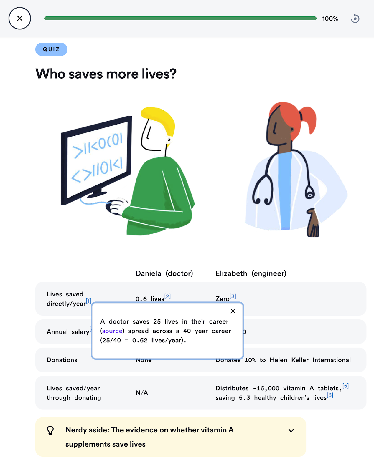
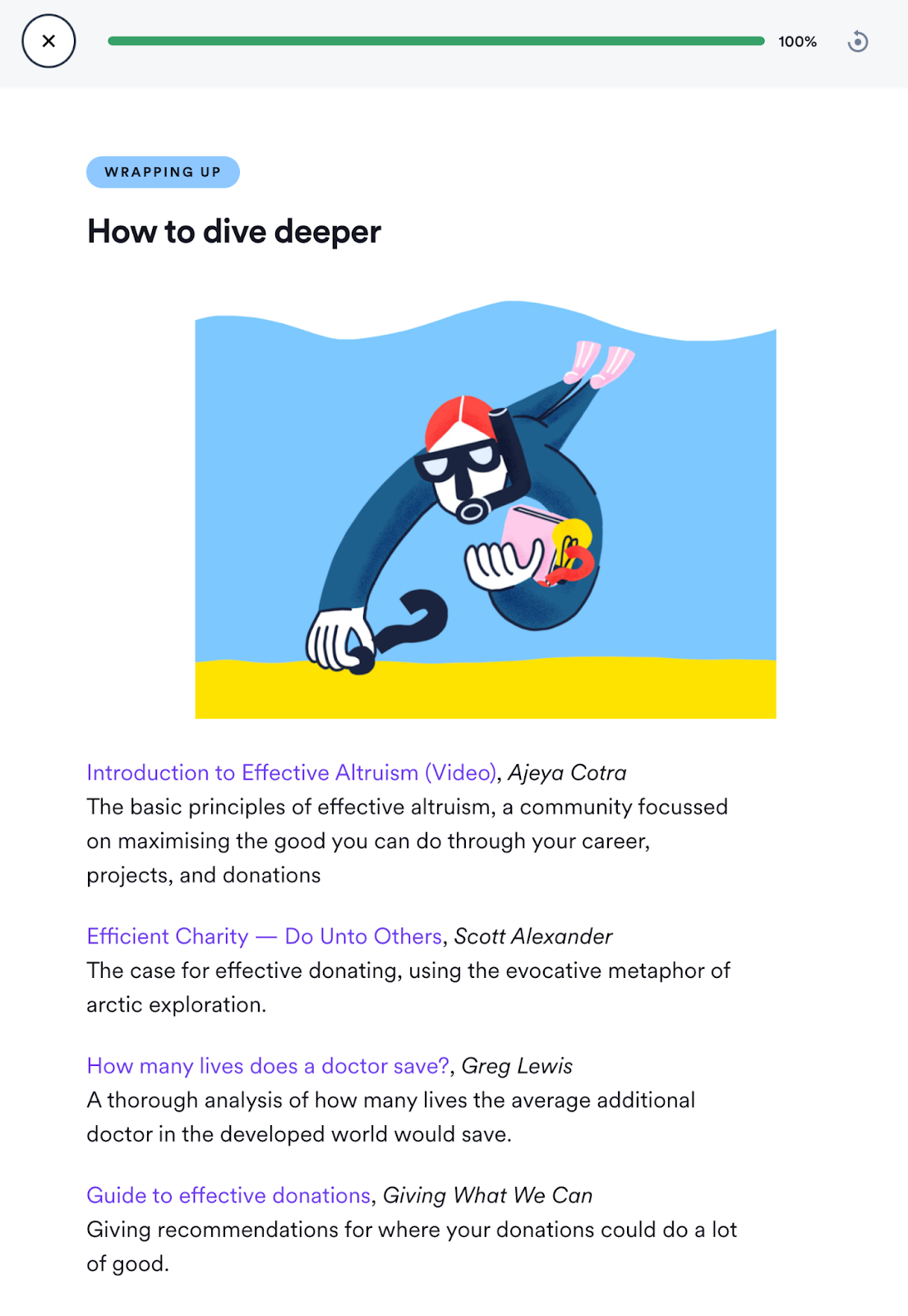
Here are a few screenshots of a lesson:


Lessons we have at the time of launch:
- You can save lives without medical training
- How not to throw away your best shot
- Most attempts to help don't work
- We radically improved the world, and could again
- Identifying and tackling prejudice
- Real impact isn't replaceable
- Making decisions under uncertainty
We have some more lessons planned about careers, the distribution of impact between actions, emerging technologies, and more. But before we move forward, we’re keen to get the community’s feedback on our direction, and the content so far.
How does Non-trivial differ from 80,000 Hours?
We both share a similar goal: growing the number of people working on the world’s most important problems.
However, 80k is a substantially more comprehensive set of resources, all focused on helping people make career decisions, and many of these resources are for an audience with a more advanced understanding of EA.
We’re trying to provide a great experience for learning, and particularly on introducing important, neglected, and tractable ideas. So we make our lessons interactive (e.g. allow you to test your understanding with quizzes), and produce shorter lessons we hope are more engaging.
Our target audience is also different – we’re focused on helping talented teenagers, whereas 80k is focused on helping university students and older.
How does Non-trivial differ from intro fellowships?
Right now, there’s no community component in our course, which some people report as one of the most valuable aspects of fellowships and virtual programs.
We see ourselves as complementary to these programs. In order to know whether they want to take part in a multi-week course, some people want to know a bit more about what they’ll be learning about, and we hope to provide an accessible introduction.
Plus, for every person interested in taking an EA introduction course, there are many people who’ve never heard about EA, but would be excited to have learned about it.
How you could help
Please give us feedback

“If you are not embarrassed by the first version of your product, you've launched too late.”
We’re still in beta, and expect to have a lot of errors. We’d really appreciate your help finding them all.
While feedback of all kinds is very welcome, we’re particularly excited to hear critical feedback. For example, any errors, confusing writing, typos, or ways anything we’re doing is likely to alienate the talented young people we want to reach.
Please comment on this post, email Peter (peter@non-trivial.org), or submit anonymous feedback to help us improve. Even if we don’t respond, we’ll read every comment and are very grateful in expectation. 🙂
Send this course to anyone who’d like it
We’re trying to get the word out that this course exists. Whether we can find enough people who want to use our platform to learn about having a big impact is the biggest input into whether we continue developing it. We would be highly grateful for your help in finding these people.
If you know anyone who wants to learn about EA or how they can do a lot of good, and you think they’d enjoy this course, we’d be grateful if you could share it with them.
If you have a social media following that you think would be interested in the course, we’d love for you to share our website (non-trivial.org) with them! Here's a Twitter thread with some ideas from the course.
Acknowledgements
Almost none of the ideas in the course are original, so we're indebted to the hard work of the researchers and writers who came up with them in the first instance.
We’re grateful for financial support from Open Philanthropy and the Future Fund.
Enormous thanks to the contributions of:
- Aaron Bergman, editing
- Anna Thomsen, illustration
- Biscuits, CFO (Chief Fluffy Officer)
- Christina Hanna, design
- Justis Mills, editing
- Massimo Cairo, full-stack development
- Tom Norton, full-stack development
Thanks to dozens of people who provided helpful comments and crucial feedback (more acknowledgements).
All errors are mine alone.
- ^
Built with ❤️ using Next.JS

I prefer something like "Imagine you're one of the first people to discover that cancer is a problem, or one of the first people to work on climate change seriously and sketch out the important problems for others to work on. There are such problems today, that don't have [millions] of smart people already working on them"
[this allows me to point at the value of being early on a neglected problem without presenting new "strange" such problems. moreover, after this part of the pitch, the other person is more welcoming to hear a new strange problem, I think]
I love this.
I really like this framing and we'll update it to something like this soon. Thanks!
I think this is a good framing, but in isolation it may (rightly) sound epistemically fishy, since you're saying from the start that you're privy to rare and highly important information, which is unlikely by definition and also a claim commonly made by cults and scams. That doesn't mean it's wrong though; there are good reasons to think EAs are privy to special information, unlike those involved in cults and scams.
Perhaps you already do so, but I would encourage anyone making this argument to follow up your framing with not just "strange" problems to work on, but an explanation of why we/you are confident in those causes despite ignorance or doubt from the general public. Maybe it's only important to highly skeptical people, but I think this is a necessary follow up for this to be a logically sound argument
HI! I'm a high-schooler (so the target audience) and I've done both the intro/in-depth fellowships. Often the fellowships required me to digest a lot of unfamiliar information and big words which became quite overwhelming for a teenager new to EA.
However, in my opinion, non trivial is far more accessible and digestible in subtly teaching EA principles to my age group. I also love the UI. I really think the team have done a great job :)
Thanks, Viha – that's very kind of you to say. Reach out if you have any thoughts on how we could improve the course :)
TL;DR: I'm a big fan of this project
My friend saw this website for less than 5 minutes and was pretty hooked.
I think this is a promising way to take take EA intros from weeks/months down to hours, while having tons of user feedback and statistics to constantly improve the process in an unusually scalable way.
Cool! Some critical feedback:
Having a quick glance at the website and thinking back to when I was a teenager getting into EA / rationality, I get the impression that this might be most appealing to younger teenagers. I think after about the age of 15+ I would have been turned off by something that seems a bit more childish (because of how colourful and cute it is) than reading whatever actual adults were reading.
I feel like a lot of very talented teenagers actively avoid content that seems directly targeted at people their age (unless it seems very selective or something) because they don't expect that to be as engaging / "on their level" as something targeted at university students.
I could see this working for 13-14 year olds though if that is your target audience.
Or maybe I was just a weird teenager.
I don't think the website looks that young tbh
Fair enough. I just felt like the website was talking down to me since the first quiz question was asking me to do some simple arithmetic and pick the correct answer.
(and later on there are yes/no quiz questions like "Is AMF likely to be helping the world?", "Are PlayPumps effective?" etc)
Kind of reminded me of the compulsory "Value Education" class we had at my high school for a while - I didn't disagree with the content and probably would have even verbally said that something like that class should have existed but in practice, I just ended up skipping it to read something fun and more challenging instead. So maybe I'm biased since it has a similar aesthetic to the workbooks we had for that class.
I think it's a tradeoff between an easier question to create a success spiral, and a challenging question to spark curiosity. But you might be right that the first question is a bit too easy though – we did also get similar feedback on this question recently.
FWIW I think I would also have been pretty unlikely to engage with any material explicitly pitched at adolescents or young adults after about the age of 15, maybe significantly earlier.
Yeah I agree that some talented teenagers don't want to engage with material targeted at their age group.
I try not to use the word teenager on the site (there may be some old references), and write basically as if it's for me at my current age without assuming the knowledge I have.
But I'm not at all sure we've got the tone and design right – I'd appreciate hearing if anyone finds any examples on the site of something that seems condescending, belittling, or unempowering etc..
Interested if you'd find the quizzes good for you at your current age? The existence of compulsory quizzes strikes me as sort of condescending. (I'd feel better about the vibe if the same content were framed as optional-but-encouraged puzzles.)
I think I'd find them helpful, though it's hard to say for sure. As one data point, I'm currently at an extremely basic level of learning javascript, and I find Codecademy's quizzes useful (as well as the project-based learning, which might be cool to replicate for EA but would take a lot of work).
FWIW the quizzes are by far our most popular feature amongst users I'm doing interviews with.
Re: making them optional. It's possible this would be better, but if a user wants to skip a quiz they can very quickly give a dummy answer, which is an ok user experience so I'm not prioritising looking into it.
One way I'm worried we're getting things wrong is getting the question difficulty right for more users. I think the early lessons might have questions that are too easy, and later lessons don't build enough on each other, so there's no scaffolding. I think we'll prioritise working on that soon. Another feature I'm hoping to build is more quiz interaction types (from cloze and drag-and-drop on the faster end to build to open text grading on the more difficult end).
Re. skipping the quiz by putting in a dummy answer: I agree the user experience is fine if people are bought into doing the whole thing. My worry is that when I try to imagine young-me, (I think) I'd feel some allergy to the fact-of-compulsory-quizzes, because of the implicit social contract of something like "these people know better; I'm here to be judged". Which might put me off the site (either making me stop reading, or just orient to the site as "something to be exploited" rather than "my friend to help me").
I'm intrigued by this thread. I don't have an informed opinion on the particular aesthetic or choice of quiz questions, but I note some superficial similarities to Coursera, Khan Academy, and TED-Ed, which are aimed at mainly professional age adults, students of all ages, and youth/students (without excluding adults) respectively.
Fun/cute/cartoon aesthetics do seem to abound these days in all sorts of places, not just for kids.
My uninformed opinion is that I don't see why it should put off teenagers (talented or otherwise) in particular, but I weakly agree that if something is explicitly pitched at teenagers, that might be offputting!
Thanks for raising this!
We haven't gotten this feedback in our user interviews yet (most have appreciated the effort to make it more visual and accessible), so I'd be curious to investigate this some more at some point.
That seems fine since you can't appeal to every type of promising teenager anyway.
Like some folks (who might have found some EA questions very interesting/important) might bounce off pretty quickly but that's okay because they would bounce off with positive-ish feelings about the content (similar to how they feel about recycling) so no harm done as they can be engaged by something else further down the line.
(It could also be because I'm thinking of talented teenagers (15+ year olds) as basically capable of engaging just as well with content designed for university students/adults but who need some extra resources/help with their specific circumstances rather than requiring entirely new introductory resources that in some ways feel dumbed down)
I'm overall glad that this exists, those are just random thoughts! :)
This looks very cool!
I'm curious about why you need to sign up to view the lessons?
Also, a quibble: some links (like the author's name next to the course) aren't actually HTML
<a>elements, which both makes it impossible to e.g. right-click and open in a new tab, and is also bad for accessibility purposes.For what it's worth, I don't think the design is particularly childish (as some others have opined). I see a similar style all the time in the creative/tech/start-up-ish world, and there it's surely aimed at adults.
+1 - I would be interested to know what the drop of rates of having the sign-in with Google are, if you've A/B tested that at all.
I'd be curious too. We haven't had enough traffic to A/b test anything yet 😅
The reason why we ask for sign in is that it allows the user to track their progress through the course, one of our user's favourite features. Learning about EA can at be an overwhelming sea of links, and we wanted to give users a clearer way to track their progress through it.
The other reason is that it's on our backlog to consider, but didn't get to it in time for launch.
I just want to give a huge round of applause to the Non-trivial team! So great to see this resource! I'm very keen to see this reach the next generation of critical thinking do-gooders!
Much excite.
Feedback: I am confused by the logo.
Feedback: I find the logo mildly unsettling. I think it triggers my face detector, and I see sharp teeth. A bit like the Radiohead logo.
On the other hand, maybe this is just a sign of some deep unwellness in my brain. Still, if even a small percentage of people get this feeling from the logo, could be worth reconsidering.
fwiw it also reminded me of the Radiohead logo.
Following the law of equal and opposite feedback: I thought the logo was great, and clearly reads as stairs to me :)
I don't know if it's something good or bad lol. I felt hypnotized by it.
I found this thread helpful, thanks everyone. I'll pass it on to our designer.
I think it's a staircase? Maybe like climbing upwards to more good stuff. Plus some cool circles to make it logo ish.
“Abstract stairs” was my best guess too. It doesn’t work for me, and I don’t get the second circle.
I clicked "submit anonymous feedback" and received this error message:
ERROR: This form is not available for public access. Please login or contact the account owner. (Error ID: 95aa2f1c464f182b4498)
Thanks for flagging this!
Can I confirm you're getting that error on this link?
No, that link works fine, but when I clicked through from the website it didn't work
I tried again, this time from this page, and it worked fine so maybe it's a one-off? Can't remember which page I originally clicked through from
https://archive.non-trivial.org/contact-us
Thanks! That's helpful. Also tested the link from the contact us page. I'll tentatively declare it fixed until I hear another report.
Oh, I've figured it out! It was from your newsletter. That link still has an error.
https://mailchi.mp/d517004dc4e0/fulfilling-impactful-careers-non-trivial-pursuits-1
Ah makes sense! That was an old feedback form we had – I expect few users will discover this in the future.
I really like the idea! Maybe that's just me, but I'd much prefer it if the content was visible without an account. (This actually stopped me from engaging with the content)
Very enthusiastic about this project, which I agree can fill an important gap in the learning journey. I will follow with great interest!
I think it would be relatively simple to replicate for languages other than English in the future. (after this passes beta phase, of course!)
This isn’t the most valuable criticism, but I’m confused why you capitalise the N and not the T in ‘Non-trivial’?
To be totally honest, I didn't actually check and just assumed. However, my read of the style guides is that you don't capitalise the second word in hyphenated titles if there's a prefix (source).
That seems unusual to me but fair enough - however in this case we're talking about a proper noun (the name of an organisation), not a common noun that happens to be in a title/heading (e.g. 'Non-trivial Efforts to Improve the Future are Possible').
That's been annoying me too!
So cool!
I am also enrolling in the course for critical feedback. I will err on the side of giving you too much critique in a too blunt way.
You can save lives without medical training:
Who saves more lives?
How not to throw away your best shot
I finished my testing here.
FYI I found this quite difficult to parse, the grammar was fairly unclear in places. I’m sure there’s great advice here, but it would be helpful if it was a bit easier to read :)
Thank you. Let me try to rephrase my main points. I emphasize that these are just my perceptions and should not be understood as an objective critique.